The Pantone Color Institute has declared the color of the year for 2019: Living Coral. The vibrant, yet soothing shade is thought to represent our ever-changing environment. Look for the warm, salmon pink shade to pop up in home decor, apparel and accessories, cosmetics, housewares and paint colors.


The Pantone Color Institute has been selecting a single color of the year (with the exception of 2016 when two colors shared the honor) for the past 20 years. Their selection is based on careful trend analysis. They explore the entertainment industry, world-wide art collections, fashion, design, and trending travel destinations. They also consider modern lifestyles, recreation trends, and socio-economic conditions. This year, they clearly give a nod to the environment, calling attention to the preservation of our coral reefs.
Color is an equalizing lens through which we experience our natural and digital realities and this is particularly true for Living Coral. With consumers craving human interaction and social connection, the humanizing and heartening qualities displayed by the convivial Pantone Living Coral hit a responsive chord.Leatrice Eiseman, Executive Director of the Pantone Color Institute
Leatrice Eiseman, Executive Director of the Pantone Color Institute
Influences of Technology and Advertising
The Institute’s color choice also takes into account new technologies, materials, textures, and relevant social media platforms. They carefully monitor heavy hitters in the advertising world, like Apple and Airbnb, to provide hints as to trends on the rise.

Floral Implications
2018’s designated color of the year, Ultra Violet, influenced wedding florals throughout the year. Greenery, the 2017 winner, impacted wedding trends in both color and use of natural materials. We expect Living Coral will do the same. In the floral world, the shade can be found in a variety of blooms: roses, dahlias, tulips, gerbera daisies, and peonies to name a few.
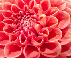
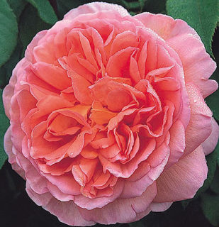
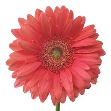
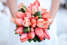
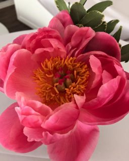
Living Coral pairs well with both light and dark colors. In floral arrangements, it is complemented beautifully by green foliage. It is equally at home with pinks and whites, or with fellow warm colors like yellow or orange. Living Coral pops against almost any shade of blue, particularly turquoise.
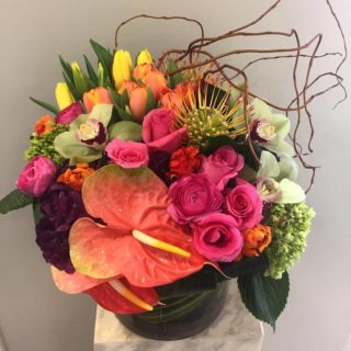
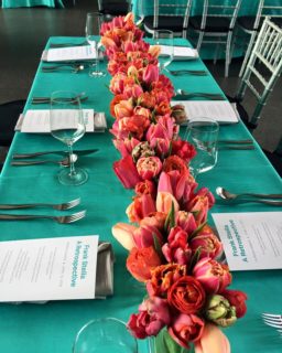
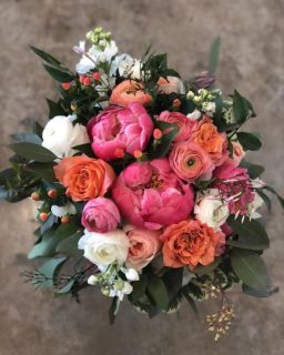
According to Pantone’s website, “Symbolizing our innate need for optimism and joyful pursuits, PANTONE 16-1546 Living Coral embodies our desire for playful expression.” Lilium agrees with their joyous assessment. We receive a variety of fresh flowers weekly, including blooms in the coral palette. We look forward to finding creative ways to incorporate this year’s Pantone Color of the Year into our fresh arrangements.
