The Pantone Color Institute’s pick for 2020 color of the year leaves us anything BUT blue! The Institute states Classic Blue has a timelessness and elegant simplicity. According to their website, it’s an honest color that offers the promise of protection. Non-aggressive and easily relatable, the trusted PANTONE 19-4052 Classic Blue lends itself to relaxed interaction.

Imbued with a deep resonance, Classic Blue provides an anchoring foundation. A boundless blue evocative of the vast and infinite evening sky, Classic Blue encourages us to look beyond the obvious to expand our thinking; challenging us to think more deeply, increase our perspective and open the flow of communication.Leatrice Eiseman, Executive Director of the Pantone Color Institute
Leatrice Eiseman, Executive Director of the Pantone Color Institute
The Pantone Color Institute has been selecting a single color of the year (with the exception of 2016 when two colors shared the honor) for the past 20 years. Their selection is based on careful trend analysis. They explore the entertainment industry and films in production, art collections, fashion, design, automotive manufacturing, and trending travel destinations. They also consider modern lifestyles, recreation trends, and socio-economic conditions. Inspirations might also come from new technology, social media platforms and even sporting events.
As we enter into a new decade, with fast-paced living and rapidly changing technology, Classic Blue suggests a sense of stability and dependability. It’s a color you can count on. In the interior design arena, the color aligns perfectly with the industry’s return to traditional decorating styles.


Dynamic Duos
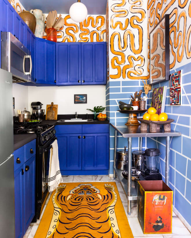
A bright white is a natural complement to Classic Blue, says Sue Wadden, director of color marketing for Sherwin-Williams. “A crisp white room accented with blue on one wall or cabinets is a classic pairing, but is still fresh,” Wadden says. “And depending on your decor, it can work for traditional, coastal, or glam styles.”

If you look at a standard color wheel, yellow is the natural complement to blue. As you move along the wheel, you’ll see that related shades of gold and orange also pop next to this blue.

Floral Blues
Last year’s color of the year, Living Coral, could be found in a wide variety of florals. Classic Blue, on the other hand, is not widely available in floral form. Blue, in general, tends to be a bit under-represented in the flower world. For florists, the most popular blue flowers are hydrangea, delphinium, and thistle. Brides who want to incorporate Classic Blue into their weddings will find it easier to do so in the dresses or linens than in the bouquets or centerpieces.
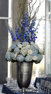


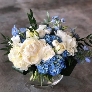
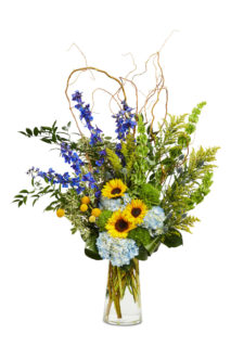 Photo: Kindig Photography
According to Pantone’s website, Classic Blue is imprinted in our psyches as a restful color that brings a sense of peace and tranquility to the human spirit. Lilium agrees with their zen assessment. We receive a variety of fresh flowers weekly, including blooms in the blue palette and coordinating hues. We look forward to finding creative ways to incorporate this year’s Pantone Color of the Year into our fresh arrangements.
