Lilium has carried Jellycat plush toys in the shop for several years. We love their unique designs and high quality craftsmanship, and they make perfect gifts for baby showers, birthdays and holidays. While we knew kids loved receiving Jellycats, we didn’t anticipate the increased interest from the teen and young adult (Generation Z) crowd. Thanks to social media platforms like TikTok, Jellycats are all the rage, and have become quite collectable.

what’s the big deal?

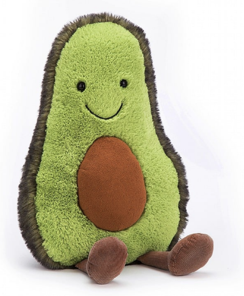
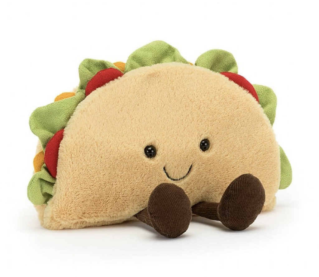
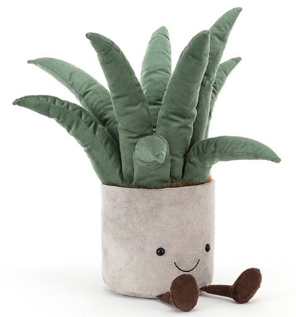
Jellycats are not your average plush toy. They are so very cuddly, made with luxury fabrics and stuffed just enough to be floppy and squeezable. Their designs range from classic teddy bears and long-eared bunnies to sea creatures, insects and dragons. The company’s Amuseable line brings everyday objects like food, plants, sports equipment, and holiday icons to life with cheerful smiles and adorable dangling legs and feet.

We started getting phone calls before Christmas this year from parents looking for specific Jellycats, not for their young children, but for their teens and young adults. TikTok, in particular, is filled with video content of Gen Zs showing off their latest Jellycat acquisition. Jellycat introduces two new collections per year, but they also retire about 75-100 plush designs per year. This creates even greater demand for the rare and hard to find Jellycat.

Jellycats have become quite collectable. There are websites for collectors that feature databases to help fans manage their collections. The company has experienced a 59% increase in online searches over the past year, with 639,000 searches per month.

HOLIDAY favorites

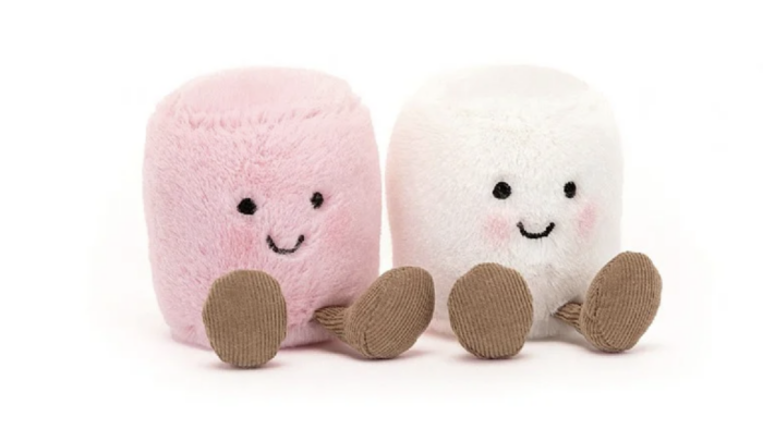
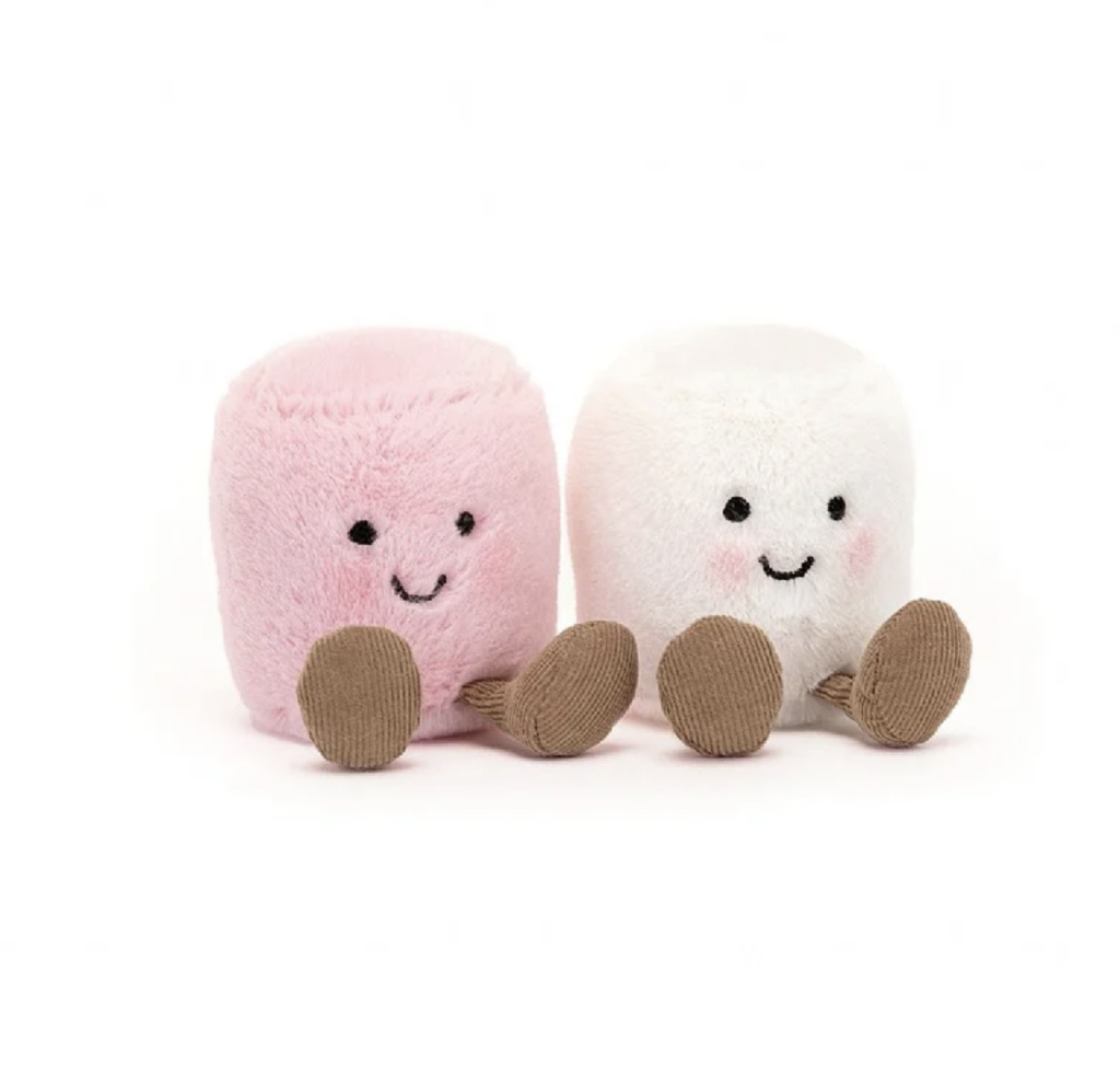
Jellycat releases new holiday styles each year, and most are sold out well before the holiday. Lilium will offer the Bashful Red Love Heart Bunny and Amusable Pink and White Marshmallows for Valentine’s Day 2024. Quantities are limited, so don’t wait to place your order, or stop by in person to claim them for your own.

New to our collection

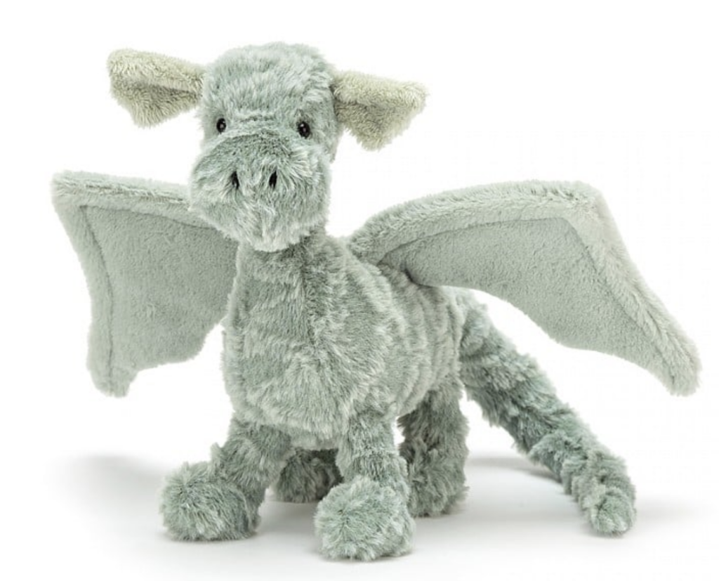
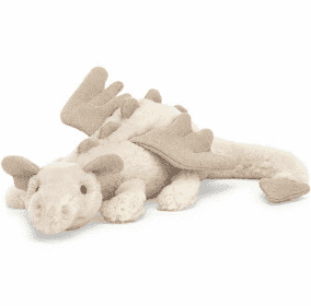
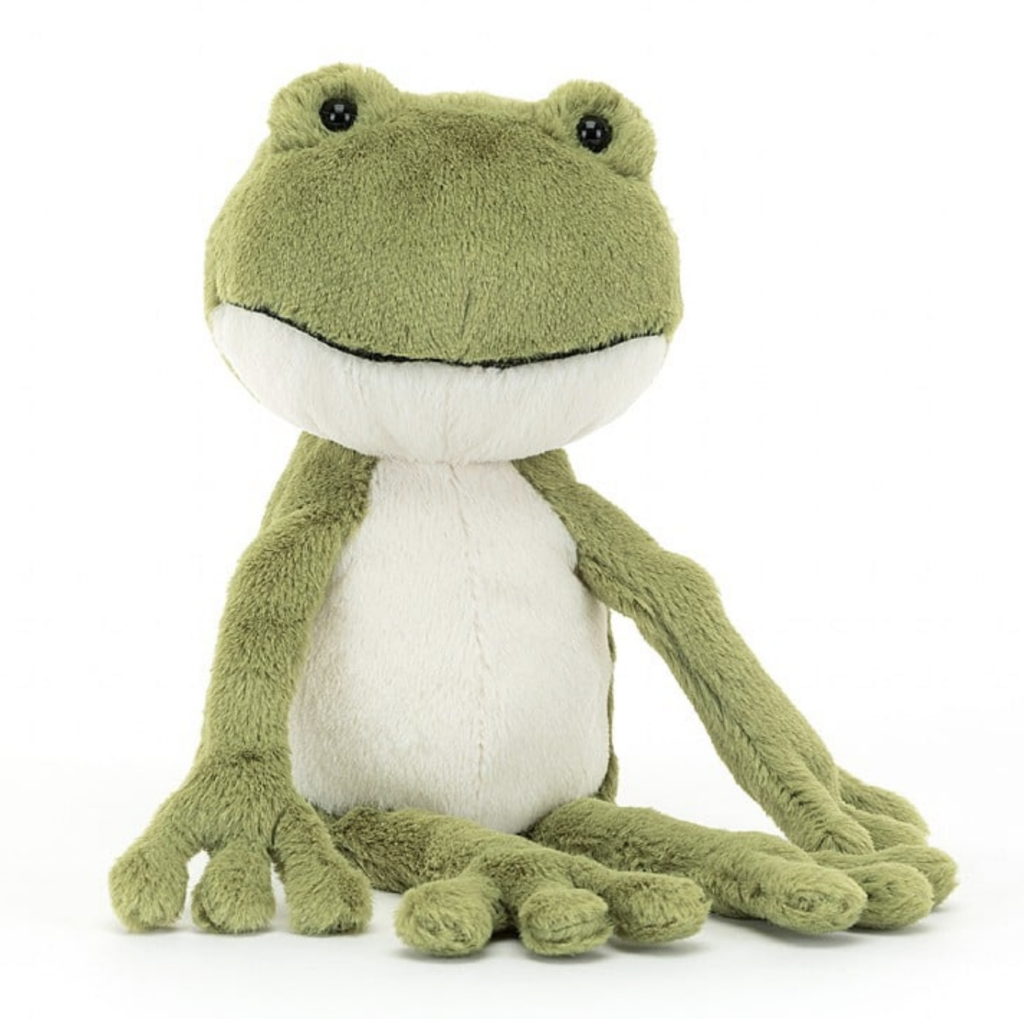
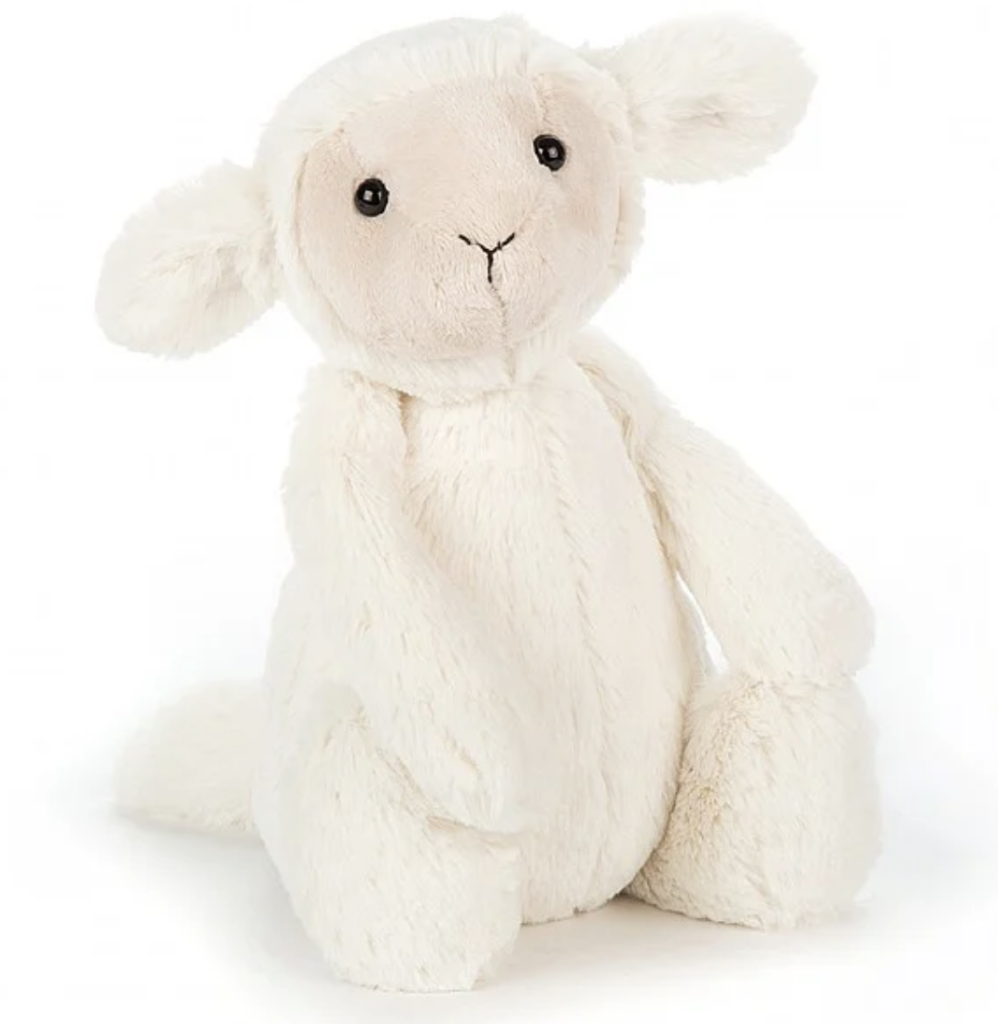
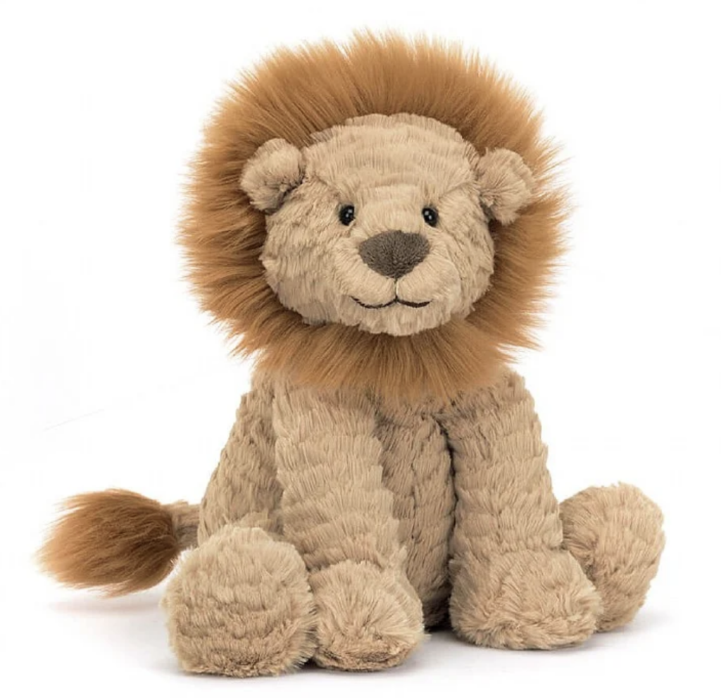
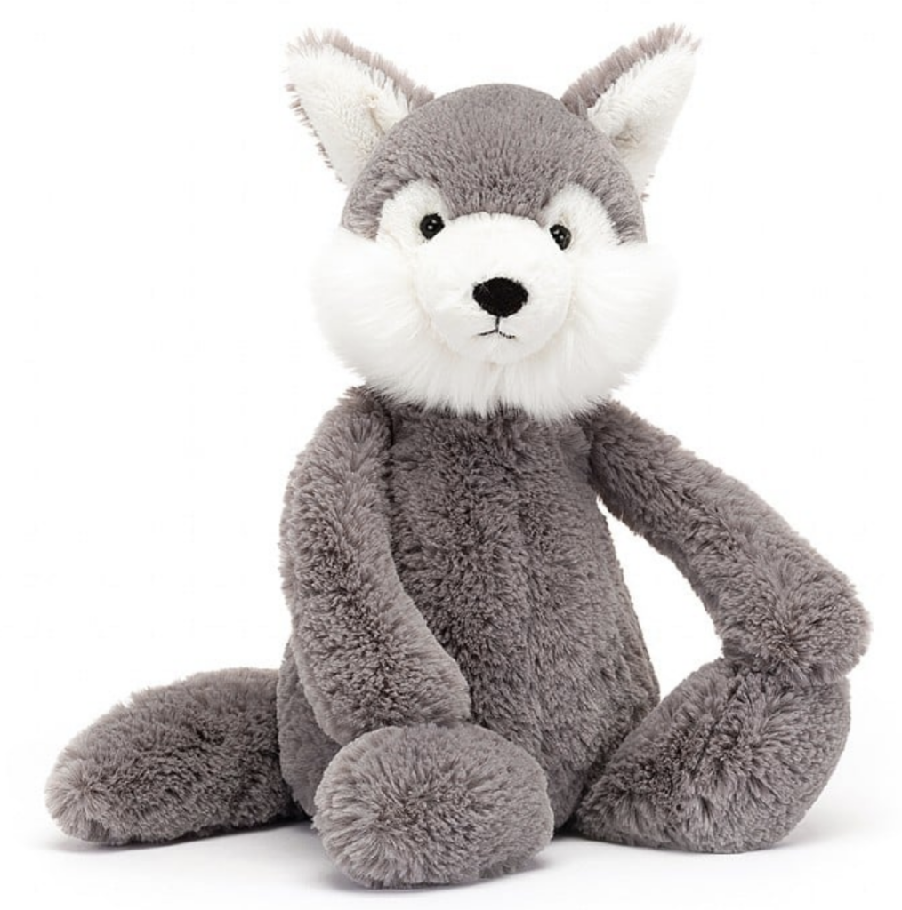
Lilium is pleased to offer a large selection of Jellycats, including bunnies, bears, kangaroos, koalas, cows and hippos. 2024 is the Year of the Dragon, so don’t miss out on Drake the Dragon (retired in 2021) and Snow Dragon. We are adding several NEW Jellycats to our inventory, including Finnegan Frog, Bashful Lamb, Fuddlewuddle Lion and Bashful Wolf.

Stop by Lilium and meet our menagerie of wonderful Jellycat creatures. Take one or two home to add to your own collection!


The world’s leading prognosticator of color trends, the Pantone Color Institute, has announced the 2024 Color of the Year: Peach Fuzz. Following last year’s vibrant pick, Viva Magenta, this year the Pantone Institute has opted for a softer, warmer, velvety hue.

This isn’t the peach of the ’80s (often paired with Seafoam Green). Peach Fuzz (Pantone #13-1023) evokes not only a color, but a texture. According to the Pantone website, “Visually arresting and inviting, Peach Fuzz is a nurturing peach tone that inspires us to instinctively want to reach out and touch. Conveying a message of tactility that comes through in sueded, velvety, quilted, and furry textures, luxuriously soothing and soft to the touch, Peach Fuzz is an enveloping peach hue that awakens our senses to the comforting presence of tactility and cocooned warmth.”

25 YEARS OF COLOR INFLUENCE

In 2024, Pantone’s Color of the Year program celebrates 25 years of highlighting the role color plays in our lives. The Color of the Year impacts fashion, cosmetics, home furnishings, product design and packaging, multimedia design and commercial interiors, to name a few. Today, the program is a globally-recognized barometer of color trends.

The Color of the Year selection is the result of ongoing discussions among Pantone Color Institute team members. They represent a wide range of design, cultural and geographical backgrounds. The common thread is expertise in color and design, and the ability to see the world through the “lens of color.”

That’s why I liken them to being color anthropologists. They have this intuitive ability to connect all that is taking place in the world and translate it into the language of color. What especially impresses me about the Pantone Color of the Year selection process is that although our Pantone Color Institute members reside in disparate locations and are involved in differing areas of design, we are always able to come to a consensus.

Laurie pressman, vice president

PEACHES ARE ALWAYS IN SEASON

You might think of peach as a spring or summer color, but it is actually versatile year-round. Some of our favorite fall arrangements include peach blooms.


brides pick PEACHes year-round

Peach is a very versatile color in the floral realm. Whether it’s peaches and creams, peaches with bright summer blooms, or peaches mixed with fall dahlias and grassy textures, brides are favoring peach hues for their ceremony and reception florals.


peachy blooms

Peach is plentiful in the floral world. Roses, dahlias, ranunculus, tulips and many other varieties are available in peach hues. It is an easy color to incorporate into a number of color palettes. As you can see below, peach can complement brights or muted tones just as easily as it works with rich jewel tones.

Contact Lilium at 817-481-1565,or visit our web site at www.liliumflorals.com to explore the use of this year’s color trends.

The Pantone Color Institute, the most respected predictor of color trends, has spoken, and they have welcomed us all to the “Magentaverse.” Viva Magenta, color 18-1750 on the Pantone chart, is from the red family. The color is thought to promote a joyous and optimistic celebration. Reds are power colors, and Viva Magenta is a bright, crimson shade that balances boldness with a feeling of fun.

 “Viva Magenta welcomes anyone and everyone with the same verve for life and rebellious spirit. It is a color that is audacious, full of wit and inclusive of all,” according to Pantone.

natural meets digital

The “Magentaverse” reference is a play on the metaverse terminology. The metaverse is a digital reality that combines all aspects of social media, online gaming and virtual reality. Viva Magenta is expected to bring natural roots to this virtual world as much as to the real world of design, fashion, home decor, and a wide range of consumer goods.

In this age of technology, we look to draw inspiration from nature and what is real. PANTONE 18-1750 Viva Magenta descends from the red family and is inspired by the red cochineal, one of the most precious dyes belonging to the natural dye family as well as one of the strongest and brightest the world has known.

Leatrice eiseman, EXECUTIVE DIRECTOR, PANTONE COLOR INSTITUTE

color collaborations

The Pantone Color Institute collaborates with companies around the world to feature the Color of the Year in their products. The Color of the Year is like the ultimate influencer. Studies have shown that color impacts 85% of buying decisions. As soon as the winning color is announced, corporate creatives jump to work to integrate the trend into their product lines and market it to consumers. A rapid response to color trends gives manufacturers and retailers an edge over their competition. After all, in just 11 months, another color will be selected, and we start over again!

Today we are living in a unique multi-dimensional environment, one that combines physical and virtual. Laurie Pressman, vice president of the Pantone Color Institute, explains, “As a result, space has been created where we are free to explore and be accepted for exactly who we feel we are, whether it be in a cybernetic universe, a conventional space, or a magical blend of both.”

what colors pair WELL with magenta?

When the Pantone Color Institute selected its pick for 2023, they also created a palette of coordinating colors. According to Pantone, the colors that best complement Viva Magenta are Pale Dogwood, Gray Sand, Gray Lilac, Pale Khaki, Fields of Rye, Agate Gray and Plein Air.

Some interior designers took this advice to heart, allowing Viva Magenta to be the star against more muted hues. In other cases, designers doubled down on the vibrant color by pairing it with another bold shade such as emerald, plum, or black.

bold florals

Florists are reacting positively to Pantone’s announcement, as nature offers many beautiful blooms that celebrate the 2023 Color of the Year. Roses, peonies, orchids, calla lilies, dahlias, ranunculus and hydrangea are only a few of the flowers available in a magenta hue.

“I think magenta is a beautiful color,” said Lilium designer Taylor Pritchett Zender. “I am excited to see the bold color used in weddings and events this year.”

Contact Lilium at 817-481-1565 or visit www.liliumflorals.com to see how you can enter the “Magentaverse” in 2023 with bold and beautiful florals.

Featured header photo courtesy of Rio Roses

For the first time in its history, the Pantone Color Institute created a new color as its Color of the Year. Very Peri, described as a vibrant periwinkle blue with violet and red undertones, was invented especially for the honor. That’s right, none of the 1,114 existing Pantone colors were deserving of the 2022 crown.

“It was really important for us to come up with a new color, because we have a very new vision of the world now,” Pantone Color Institute executive director Leatrice Eiseman recently told CNN in an interview. In choosing the color(s) of the year, the Institute considers global events. The Covid-19 pandemic continues to influence their choices. In 2021, for only the second time, two colors were selected: Ultimate Gray and Illuminating (bright yellow). The colors symbolized emergence from a dreary time into a brighter future. Likewise, the Institute felt that Very Peri was a hopeful and happy shade that created a feeling of newness.

As we move into a world of unprecedented change, the selection of PANTONE 17-3938 Very Peri brings a novel perspective and vision of the trusted and beloved blue color family, encompassing the qualities of the blues, yet at the same time with its violet undertone, Very Peri displays a spritely, joyous attitude and dynamic presence that encourages courageous creativity and imaginative expressions.

Leatrice Eiseman, executive director of the Pantone Color Institute

Digital influences

In addition to world events, Pantone studies the entertainment industry, art, fashion, design, travel and lifestyles for emerging trends. This year, technology played an integral part in their choice as our lives are increasingly tied to the digital realm, or metaverse. The color is found in platforms from the Fortnite video game to Zoom call backgrounds. To further promote the tech theme, Pantone partnered with Microsoft to launch Very Peri as a series of wallpapers, PowerPoint palettes, and even a Teams camera filter. 


peri partners

To give you a little inspiration for incorporating Very Peri into your world, Pantone provides suggested palettes. The color can be the star of the show among neutrals. It also serves as a complement to brighter hues.


Benjamin Moore paint company’s Color Preview collection includes Scandinavian Blue, which closely resembles Very Peri. They suggest pairing the color with a creamy white and silvery pale blue shade.


Peri weddinG?

Apart from the actual periwinkle flower (vinca), the blue-purple Very Peri color is rare in fresh florals. If you’ve fallen in love with the color and want to use it in your upcoming wedding, Lilium designers recommend incorporating the shade in your reception linens, invitations/announcements, bridesmaid dresses and accessories. It’s easier to coordinate florals to compliment the periwinkle tones than to find flowers in that specific shade. As shown in the suggested palettes above, there are many ways to build a color story around Very Peri.

For only the second time in 20 years, the Pantone Color Institute has selected not one, but two independent shades as its Color of the Year 2021. This year’s color winners are: Ultimate Gray and Illuminating. Perhaps the underlying message is that we are ready to emerge from the “gray” 2020 period into a brighter, sunnier 2021. Or, maybe gray can be viewed as a stable and solid hue, while yellow points to optimism and hope. The two colors, used together, create balance.

See the source image


The union of an enduring Ultimate Gray with the vibrant yellow Illuminating expresses a message of positivity supported by fortitude. Practical and rock solid but at the same time warming and optimistic, this is a color combination that gives us resilience and hope. We need to feel encouraged and uplifted; this is essential to the human spirit.

Leatrice Eiseman, Executive Director of The Pantone Color Institute

Yellows and Grays, Let Me Count the Ways

For more than 20 years, The Pantone Color of the year has influenced product development and purchasing decisions in a wide array of industries, including fashion, commercial and industrial design, home decor, and product packaging. There are other color systems, but the Pantone color matching system is the most internationally recognized standard.

“Language of color is really important for anybody who makes product. Anyone who designs product not in their garage, but through some sort of a supply chain where they’re going to lose control of that color design, they need a language to use with the supplier and say, ‘This is the color that I need.’ It’s very difficult to just send them a sample and say, ‘Give me that color.’ ”

Ron Potesky, a former senior vice president at Pantone

The annual selection is made through trend analysis and color influences, also taking into account world events and socio-economic conditions. Influences include art and films, fashion, social media platforms, and leisure and travel trends. The 2020 selection, Classic Blue, was a return to timeless tradition, while the 2019 pick, Living Coral, represented our changing environment.

Floral Pairings

The annual Pantone pick even influences the floral industry, as event planners incorporate the color trends into special events. Brides also tend to look to the trends when selecting wedding colors. Florals are easy to come by in yellow shades. Roses, lilies, chrysanthemums, tulips, daffodils, sunflowers, orchids and ranunculus are only a few of the floral varieties available in sunny yellow. While there aren’t many gray flowers (not fresh varieties, at least), floral designers can add touches of gray using dusty miller, lamb’s ear or silver sage.

Once the Color of the Year is announced in December, it takes a little time for product manufacturers and design professionals to put products on the shelves, racks and showroom floors. As we near the second quarter of 2021, you are likely noticing the use of grays and yellows, both individually and paired. Gray has been a staple in design for several years now, but combining it with yellow gives it a fresh take.

Lilium Floral Design is on top of the trends in the floral and event industries, and we can help you incorporate the 2021 Colors of the Year into your upcoming event. Visit our website, or call us at 817-481-1565.

The color experts at the Pantone Color Institute have named their Color of the Year for 2018: Ultra Violet. The annual announcement is much-anticipated by designers, manufacturers and trend watchers throughout the country. The chosen color influences fashion, cosmetics, and all things for the home, from paint to textiles, furnishings to florals. Ultra Violet (Pantone 18-3838) is a celestial shade of purple, that falls on the cooler end of the spectrum. It calls to mind  the vastness of the galaxy and all its mysteries.

Ultra Violet influences across multiple categories

Pantone’s Power

Pantone is synonymous with color for a vast array of industries, but it started in the printing industry. They developed an innovative color matching system in 1962, including a swatch book, that ensures colors chosen would match from one print job to the next. The idea spread to include other industries, including plastics, digital technology, fashion and home. As the existing standard for accurate color communication, their color of the year selection becomes more influential with each passing year.

Ultra Violet dominates graphic design and packaging.
Ultra Violet influences beauty products

When choosing the annual color of the year, Pantone experts consider influences from fashion, film, technology, art and travel. They visit venues and events all over the world, including art shows, auto shows, and world events like the Olympic Games, making note of how color is being used.

Pop culture also influences the choice. For example, musical icons Prince, David Bowie and Jimi Hendrix have often been associated with shades of purple. The color evokes creativity and originality. It is also associated with royalty, wealth and complexity.

We are living in a time that requires inventiveness and imagination. It is the kind of creative inspiration that is indigenous to PANTONE 18-3838 Ultra Violet, a blue-based purple that takes our awareness and potential to a higher level. From exploring new technologies and the greater galaxy, to artistic expression and spiritual reflection, intuitive Ultra Violet lights the way to what is yet to come.Leatrice Eiseman, Executive Director of the Pantone Color Institute

Leatrice Eiseman, Executive Director of the Pantone Color Institute

Purple Pairings

The shade has both warm and cool tones in it, which makes it versatile. Ultra Violet blends well with other shades of purple, and also serves as a strong complementary color. Suggested palettes include:

Purple Reigns

In the floral industry, purples are popular for all occasions, but there is definitely a trend toward purple for weddings. Flowers in shades of purple are available in abundance, and, as you can see from the suggested palettes above, they pair well with many other hues a bride might want to include.

Ultra Violet can be incorporated into floral arrangements for any occasion. It can be either masculine or feminine, so it is a very versatile color. Flowers that capture the spirit of the 2018 Pantone color of the year include calla lilies, hydrangea, dahlias, lisianthus, zinnias, asters, roses, scabiosa, lilacs, chrysanthemums, delphinium, hyacinth, orchids, stock, violets and tulips.

Stop by Lilium or visit our website at www.liliumflorals.com to explore your passion for purple, and visit the Pantone Color Institute website at www.pantone.com to read more about this year’s pick.

Vintage Roots

What was old is new again. As with many styles and trends, they tend to fade away only to reemerge years later in a fresh new way. Pin-on corsages gave way to wrist corsages, which are now losing favor to the up-and-coming tussie mussie.

The tussie mussie  has been around the block a few times. Originating in the Victorian era, tussie mussies were once made of herbs and flowers presented in a lace doily. The flowers were chosen to convey a subtle message, such as pink for warm affection or red for passionate love.

A Modern Take

The modern version of the tussie mussie is a charming compact bouquet tied with ribbon. The flowers are selected less for their traditional meanings and more to coordinate with a dress or theme. The tussie mussie has several advantages over the wrist corsage:

  • It is larger, and can be made using a wider variety of flowers.
  • It makes a beautiful impact in pictures, but then can be placed on the table (and not in the way when the dancing begins).
Photo credit: Shaun Menary Photography
  • Tussie mussies can be put in a vase (provided) after the event and enjoyed for several days.
Photo credit: Convey Studios

Even though the tussie mussie is larger than the wrist corsage, the price is about the same. With a wrist corsage, a good percentage of the cost is attributed to labor. It takes about 20-25 minutes to make a single corsage, as each stem is individually wrapped, then tied together. Tussie mussies can be made in half the time, with more of the budget going into the flowers and greenery. So, in essence, the tussie mussie provides more bang for the buck.

Lilium has seen more and more teens opting for a tussie mussie during the past two prom seasons. The long-lasting bouquet is the most popular pick for several local proms, with the trend rapidly spreading to other campuses. Due to our capacity, this year we are offering exclusively tussie mussies, as well as boutonnieres, to our prom clients. Because prom season coincides with a busy wedding season, as well as Mother’s Day, we recommend placing orders early to take advantage of this popular trend.

Lilium heartily approves of this year’s Pantone color of the year: Greenery. Of course, to us, it is Lilium green. It is the shade used in our logo, and throughout our shop, so we may be a bit partial. We are glad that others are embracing one of our favorite shades in 2017.

Each year, the Pantone Color Institute selects one color that symbolizes what is taking place in our global culture. It serves as an expression of mood and attitude.

Lee_Eisemann Pantone Color of the Year 2017 GREENERY

The name “greenery” describes a yellow-green hue inspired by vibrant colors found in nature. It is a nod to the go-green movement aimed at celebrating and protecting our environment. It evokes a spirit of renewal and restoration. The Pantone Color Institute sees Greenery as a versatile color that can be used with many different palletes. Their website displays it in combination with neutrals, brights, pastels and even metallics. Look for the color to show up in fashion, beauty products and home decor.

There are several naturally green flowers that beautifully display the trend. They include dianthus, bells of Ireland, and hellebores, as well as green cymbidium orchids and Fuji spider mums shown in bouquets below.

Photos by Perez Photography

Wedding Greenery

Use of greenery, as the term applies to natural foliage, is also on trend. At Lilium, we use greens in combination with florals in many of our designs. However, this year, greenery gets the starring role. Many of this season’s brides are opting for minimal florals and more foliage. The result is organic and natural, but still beautiful. Greenery garlands frame the altar and form fresh table runners. Clusters of greens take the place of traditional centerpieces and cake flowers.

Photo credit: Light Box Photography

Bridal bouquets get a fresh and natural twist with a mixture of textures and green hues. Whereas greenery was once considered “filler,” it’s role is now as important as the flowers. The florals compliment the greenery rather than the other way around.

Photo credit: Swan Photography

Lilium stays on top of current trends in color and style to offer our customers the very best in floral design. We are excited to embrace this year’s Pantone pick, and look forward to sharing it with our clients.

Florals are in full bloom for spring and summer weddings. This season, not only will the bridal party be carrying flowers, they may be wearing them as well. One of the biggest fashion trends this season is floral prints, and brides are finding creative ways to incorporate the theme into their spring and summer nuptials. Feminine and romantic, flower patterns are perfect for outdoor weddings, but can really be used in any venue.

From sweet and subtle hints to bold patterns and hues, floral prints dominated the bridal runways this season. Some brides may choose to wear traditional white, while putting their attendants in patterned gowns. Other brides are abandoning tradition in favor of the flowery trend for their own gowns.

Even if you prefer to stick with solid white or ivory for the wedding dress, consider having a pretty floral shoe peeking out from beneath the hem.

Florals for the Men, Too

Floral prints aren’t just for the ladies. Grooms and groomsmen are sporting floral neckties and bow ties as well. Prints are easily paired with solid-colored suits and tuxedos, and do not have to match the ladies’ prints exactly. Choose smaller prints for a more formal look, or big, bold patterns for a more casual theme.

Mixing Fabric and Fresh Florals

If you are concerned about overpowering your guests with your floral theme, Lilium’s wedding coordinator and lead designer, Taylor Pritchett, suggests brides maintain a balance. “If the fabric print is subtle, fresh flower choices can add a pop of color. On the other hand, if the fabric has bold floral print, opt for a neutral pallete for bouquets and boutonnieres.”

If you envision a floral motif for your spring or summer wedding , let Lilium design the perfect fresh bouquets, boutonnieres and arrangements to complement your flower-themed attire.